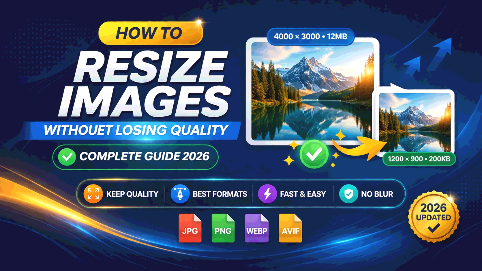
Quick Summary: Resizing images the wrong way destroys quality and kills your website speed. In this guide, you’ll learn exactly how to resize images without losing quality — using the right tools, formats, and techniques for every platform, from websites to social media.
Table of Contents
Why Image Resizing Matters More Than You Think
You’ve just taken a stunning 12-megapixel photo. You upload it to your website. The page takes 8 seconds to load. Visitors leave. Google penalizes your ranking. Your bounce rate skyrockets.
Sound familiar?
Here’s the truth: unoptimized images are the #1 cause of slow websites. According to Google PageSpeed Insights, images Takes up to 75% of a web page’s total byte size. Yet most people — bloggers, designers, small business owners — still upload raw, unresized images directly to their sites.
Learning how to resize images without losing quality is one of the highest-ROI skills you can develop as a content creator or web professional. Done right, you get smaller file sizes, faster load times, better SEO rankings, and images that still look crisp and professional on every screen.
This guide covers everything: the science behind image quality, practical step-by-step resizing methods, the best formats to use, common mistakes to avoid, and real-world examples for websites, social media, and blogging. Whether you’re a complete beginner or a seasoned developer, there’s something here for you.
What Does “Losing Quality” Actually Mean?
Before we Resize Images Without Losing Quality, let’s understand what image quality really means — because most people confuse the symptoms with the cause.
Resolution vs File Size: Not the Same Thing
Resolution refers to the number of pixels in an image, typically described as width × height (e.g., 1920 × 1080). More pixels = more detail = larger file size.
File size is how much disk space the image occupies. A 4000 × 3000 PNG might be 15 MB. The same image compressed as a WEBP could be under 500 KB — with nearly identical visual quality.
Quality loss happens when:
- You enlarge a small image (pixels get stretched and the image becomes blurry)
- You over-compress an image (artifacts appear, colors look muddy)
- You use the wrong format (e.g., saving a photo as a PNG when WEBP would be better)
- You resize without maintaining aspect ratio (the image gets squished or stretched)
Understanding Aspect Ratio
Aspect ratio is the proportional relationship between an image’s width and height, expressed as W:H. A 1920 × 1080 image has a 16:9 aspect ratio. A 1000 × 1000 image is 1:1 (square).
When you resize an image, always maintain the original aspect ratio unless you intentionally want to crop it. Breaking the aspect ratio distorts faces, logos, and objects — making them look unprofessional.
Example: You have a 1200 × 800 image (3:2 ratio). If you resize it to 600 × 400, you maintain the ratio. If you resize it to 600 × 500, you’ve broken it — and the image will look squished vertically.
What is DPI and Does It Matter for Web?
DPI (Dots Per Inch) is a print measurement that describes how many ink dots are placed per inch. 300 DPI is standard for high-quality print. 72 DPI is the web standard.
Here’s the key insight most people miss: DPI does not affect how an image looks on a screen. Screens display pixels, not dots. What matters for web images is the pixel dimensions, not the DPI value. However, if you’re preparing images for print (business cards, brochures, posters), you need 300 DPI at the intended print size.
Rule of thumb:
- Web images: 72–96 DPI, focus on pixel dimensions
- Print materials: 300 DPI minimum, scaled to physical print size
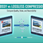
Image File Formats Explained: JPG vs PNG vs WEBP
Choosing the right format is just as important as choosing the right dimensions. Here’s a full breakdown:
Comparison Table: JPG vs PNG vs WEBP
| Feature | JPG/JPEG | PNG | WEBP |
|---|---|---|---|
| Compression Type | Lossy | Lossless | Both (lossy + lossless) |
| Transparency Support | ❌ No | ✅ Yes | ✅ Yes |
| File Size | Small–Medium | Large | Smallest |
| Quality at Small Size | Good | Excellent | Excellent |
| Best For | Photos, banners | Logos, screenshots, illustrations | All web use |
| Browser Support | Universal | Universal | 95%+ modern browsers |
| Recommended Quality Setting | 75–85% | N/A (lossless) | 80% |
| Average Size vs JPG | Baseline | 2–5× larger | 25–35% smaller |
When to Use Each Format
Use JPG when:
- Uploading photographs or images with many colors
- File size is a priority and transparency isn’t needed
- You’re targeting older browsers or email clients
Use PNG when:
- Your image has a transparent background (logos, icons)
- You need pixel-perfect screenshots or diagrams
- The image contains text that must remain sharp
Use WEBP when:
- You’re building a modern website and want the best performance
- You need to dramatically reduce image file size without quality loss
- You want to support both photos and transparent images with one format
💡 Pro Tip: Use our JPG to WEBP Converter to switch your existing images to WEBP and instantly improve your web performance scores.
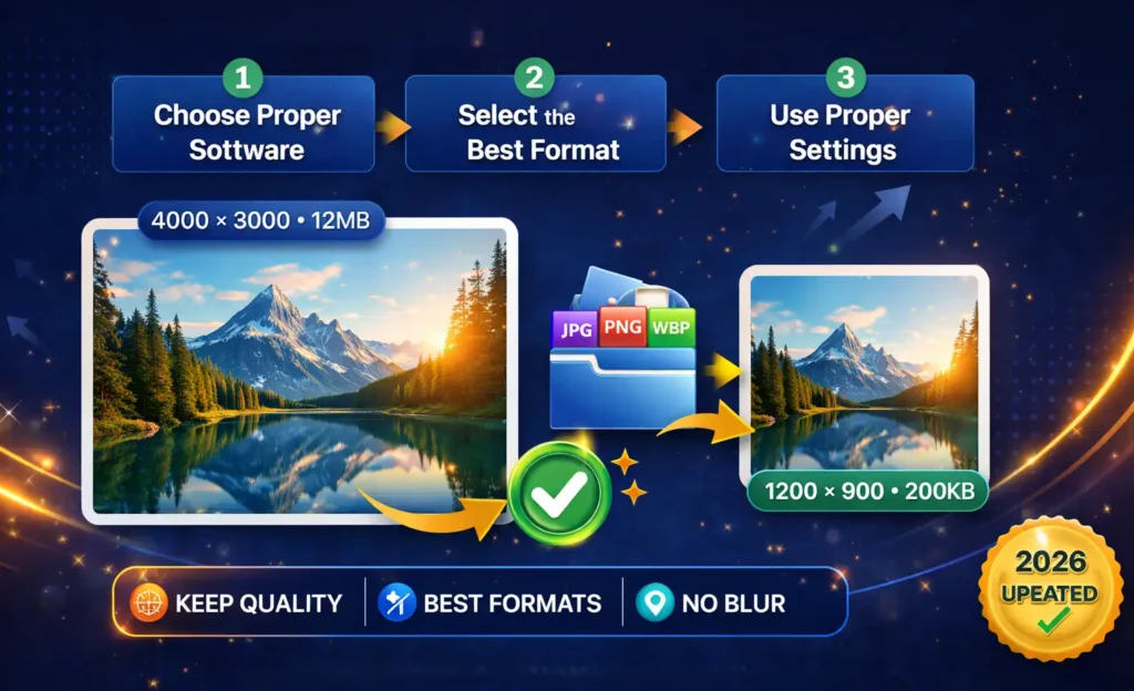
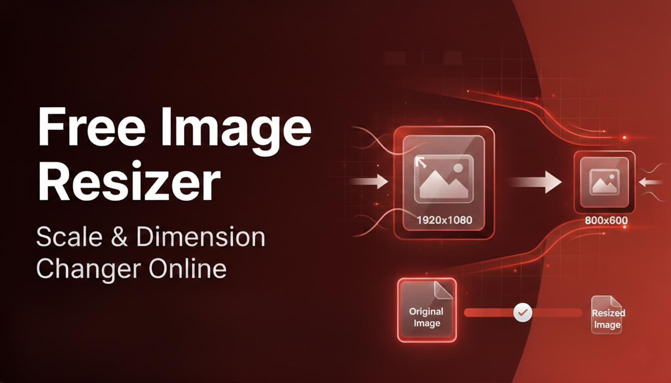
Step-by-Step: How to Resize Images Without Losing Quality
Method 1: Using an Online Image Resizer (Easiest)
After knowing How to Resize Images Without Losing Quality You must know how to use a online Image Resizer Tool.
Step 1: For image optimization, First Upload your original image to an Image resizer tool.
Step 2: Enter your target dimensions (width × height in pixels). If the image resizer has a “Lock Aspect Ratio” checkbox, enable it — this prevents distortion.
Step 3: Choose your output format. For web use, select WEBP or JPG. For logos/icons with transparency, choose PNG or WEBP.
Step 4: Set the quality level. For JPG, 80–85% quality is the sweet spot — you get a small file size with no visible quality loss to the human eye. For WEBP, 80% is generally ideal.
Step 5: Download the resized image and compare it side-by-side with the original. Zoom in to 100% to check for any artifacting.
Step 6: Test the page load speed improvement using Google PageSpeed Insights before and after replacing your images.
Method 2: Using Adobe Photoshop (Professional)
Photoshop remains the gold standard for precision image resizing and Image optimization.
Step 1: Open your image in Photoshop (File → Open).
Step 2: Go to Image → Image Size. A dialog box will appear showing current dimensions and resolution.
Step 3: Make sure “Constrain Proportions” (or the chain link icon between width and height) is checked. This locks the aspect ratio.
Step 4: Change the width or height to your target size. The other dimension will update automatically.
Step 5: For Resample Method, choose:
- Preserve Details 2.0 — best for enlarging images
- Bicubic Sharper — best for reducing image size
- Bicubic Automatic — good general-purpose choice
Step 6: Click OK, then go to File → Export → Export As (not “Save As”) to control format and quality settings precisely.
Step 7: In the Export dialog, choose your format (JPEG, PNG, or WebP), adjust quality to 80–85 for JPEG, and click Export.
Method 3: Using GIMP (Free & Open Source)
GIMP is a powerful free alternative to Photoshop.
Step 1: Open your image in GIMP (File → Open).
Step 2: Go to Image → Scale Image.
Step 3: Enter your desired width or height. The chain link icon between the fields ensures proportional scaling — make sure it’s linked (connected).
Step 4: Set Interpolation to Cubic or Sinc (Lanczos3) for the best quality when downscaling.
Step 5: Click Scale.
Step 6: Export via File → Export As. Choose your format and adjust quality settings before saving.
Method 4: Command Line with ImageMagick (Developer Method)
For developers or anyone processing large batches of images, ImageMagick is unbeatable.
# Resize to specific width, maintain aspect ratio
convert input.jpg -resize 800x output.jpg

# Resize to exact dimensions (may distort if ratio differs)
convert input.jpg -resize 800x600! output.jpg

# Resize and set quality (1–100, 85 recommended)
convert input.jpg -resize 800x -quality 85 output.jpg

# Convert JPG to WEBP with quality setting
convert input.jpg -quality 80 output.webp

# Batch resize all JPGs in a folder
for f in *.jpg; do convert "$f" -resize 1200x -quality 85 "resized_$f"; done
Real-World Examples When and How to Resize
Example 1: Blog Post Featured Images
A food blogger uploads a 4200 × 2800 px raw photo (8.4 MB) as a blog post header. The page load time jumps to 7 seconds.
The fix: Resize to 1200 × 800 px, export as WEBP at 80% quality. Result: 95 KB. Page loads in under 1 second. Google rewards the faster page with higher rankings.
Optimal blog image sizes:
- Featured/hero image: 1200 × 630 px
- In-post images: 800–1000 px wide max
- Thumbnail images: 300 × 300 px
Example 2: E-Commerce Product Images
An online store uploads product photos at 3000 × 3000 px each. With 20 products per page, the catalog page weighs 60 MB.
The fix: Resize to 800 × 800 px for grid view, 1200 × 1200 px for zoom view. Use WEBP format. Add a lazy loading attribute so images only load when they scroll into view.
Result: Page weight drops from 60 MB to under 4 MB. Conversion rate improves because users don’t leave during the wait.
Example 3: Logo Resizing for a Website Header
A designer saves a company logo as a 2400 × 1200 px JPG. It looks fine at desktop size but appears blurry on mobile because the browser has to scale it down.
The fix: Export as a 400 × 200 px SVG (vector, infinitely scalable) or PNG with transparency at 2× (800 × 400 px for Retina/HiDPI screens). Use CSS to display it at 400 × 200 px max-width.
Best Image Sizes for Social Media Platforms
Use this reference guide every time you create social media content. Always export as JPG (for photos) or PNG (for graphics with text), and keep file sizes under 1 MB where possible.
| Platform | Image Type | Recommended Size | Aspect Ratio | Max File Size |
|---|---|---|---|---|
| Square Post | 1080 × 1080 px | 1:1 | 8 MB | |
| Portrait Post | 1080 × 1350 px | 4:5 | 8 MB | |
| Story / Reel | 1080 × 1920 px | 9:16 | 30 MB | |
| Feed Post | 1200 × 630 px | 1.91:1 | 10 MB | |
| Cover Photo | 820 × 312 px | 2.63:1 | 100 KB | |
| Twitter/X | In-stream Photo | 1200 × 675 px | 16:9 | 5 MB |
| Post Image | 1200 × 627 px | 1.91:1 | 5 MB | |
| Standard Pin | 1000 × 1500 px | 2:3 | 10 MB | |
| YouTube | Thumbnail | 1280 × 720 px | 16:9 | 2 MB |
📌 Reference: Always check the Instagram Image Size Guide and official platform documentation as these specifications can change with platform updates.
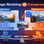
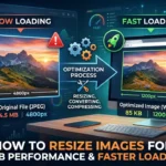
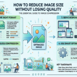
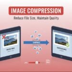
Image Optimization for Web Performance
Resizing is only half the battle. True image optimization combines resizing with compression, format selection, and delivery strategy.
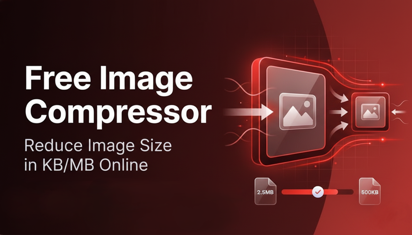
Using an Image Compressor in Your Workflow
After resizing, run images through an Image Compressor Tool to strip unnecessary metadata (EXIF data like GPS coordinates, camera model, etc.) and further reduce file size without affecting visual quality.
A typical workflow:
- Capture or source your original high-resolution image
- Resize to target dimensions using the method best for your skill level
- Convert to WEBP using a JPG to WEBP Converter if targeting modern browsers
- Compress to remove metadata and apply final size reduction
- Implement lazy loading in your website HTML (
loading="lazy"attribute) - Use responsive images with the
srcsetattribute to serve different sizes to different screen sizes
The srcset Attribute: Serving the Right Size Automatically
<img
  src="image-800.webp"
  srcset="image-400.webp 400w, image-800.webp 800w, image-1200.webp 1200w"
  sizes="(max-width: 600px) 400px, (max-width: 1000px) 800px, 1200px"
  alt="Descriptive alt text here"
  loading="lazy"
>
This tells the browser: “Pick the best image size for the visitor’s screen automatically.” This alone can cut mobile image bandwidth by 50–70%.
Common Mistakes When Resizing Images
These are the errors that silently kill image quality and web performance:
1. Enlarging a small image to make it “bigger” You cannot add detail that doesn’t exist. Enlarging a 200 × 200 px image to 1000 × 1000 px will always result in a blurry, pixelated mess. Always start with the highest-resolution source available.
2. Saving over the original file Always keep your original, unedited image. Save resized versions as separate files. Once you save a JPG at lower quality, the compression artifacts are permanent.
3. Ignoring aspect ratio Resizing an image to 500 × 700 when the original is 500 × 500 will stretch it. Use constrain/lock aspect ratio in every tool you use.
4. Using the wrong format for the content type Saving a photograph as a PNG creates unnecessarily large files. Saving a logo as a JPG creates muddy edges and no transparency. Always match format to content type.
5. Compressing too aggressively Setting JPG quality to 50% or lower introduces noticeable blockiness and color banding. Stay between 75–85% for a balance of quality and file size.
6. Skipping compression after resizing Resizing reduces file size, but running the image through a compressor removes hidden metadata (sometimes 30–50 KB per image) for zero visible quality loss.
7. Not testing on mobile An image that looks great on a desktop monitor can look terrible on a mobile screen. Always preview resized images on multiple devices or use browser developer tools.
Pro Tips: Advanced Techniques for Perfect Results
✅ Use 2× images for Retina/HiDPI screens If your website displays an image at 600 × 400 px, export it at 1200 × 800 px. Retina screens use two physical pixels per CSS pixel, so they’ll look razor-sharp. Use the srcset attribute to serve regular images to non-Retina screens.
✅ Use WEBP for all web images WEBP is now supported by over 95% of browsers. It delivers 25–35% smaller file sizes than equivalent JPG with the same or better quality. Switch your entire image library with a JPG to WEBP Converter
✅ Strip EXIF metadata before publishing Photos taken on smartphones contain EXIF metadata including GPS location, device info, and timestamps. Strip this before uploading — it reduces file size and protects privacy.
✅ Use vector formats (SVG) for logos and icons SVG files are code-based and scale to any size without quality loss. For anything that needs to appear at multiple sizes (logos, icons, buttons), SVG is always the best choice.
✅ Test with Google PageSpeed Insights It gives you a score and specific recommendations. Use it as your quality control checkpoint. Aim for a score above 90 for both mobile and desktop.
✅ Use a CDN for large sites A Content Delivery Network (CDN) serves images from servers geographically close to your visitors, dramatically reducing load times. Many CDNs also auto-compress and auto-convert to WEBP on the fly.
✅ Automate with an image pipeline If you publish frequently (news sites, e-commerce stores, photographers), set up an automated image pipeline using tools like Cloudinary, ImageKit, or Imgix that automatically resize, compress, and serve the best format for each visitor.
FAQ: How to Resize Images Without Losing Quality
Conclusion: Get Your Images Working For You
Knowing how to resize images without losing quality isn’t just a technical skill — it’s a business advantage. Faster websites rank higher on Google, convert more visitors, and deliver a better user experience. Better-sized social media images get more engagement. Properly formatted images protect your brand.
Here’s your simple action plan:
- Audit your current website images using Google PageSpeed Insights — identify the biggest offenders
- Resize them to the correct pixel dimensions for their display context
- Convert to WEBP using the JPG to WEBP Converter for maximum compression
- Compress the final files using the Image Compressor Tool to strip metadata
- Implement lazy loading and
srcsetfor responsive serving - Monitor your PageSpeed score monthly and repeat as needed
You don’t need expensive software or a computer science degree. With the right workflow — resize, convert, compress — you can transform a slow, bloated website into a fast, visually sharp experience that both your visitors and Google will love.
Start with just one image. Notice the difference. Then apply it to everything.
Found this guide helpful? Share it with a fellow blogger, developer, or business owner who’s still uploading full-resolution images directly to their website. You could save them hours of troubleshooting and a lot of lost traffic.


Leave a Reply